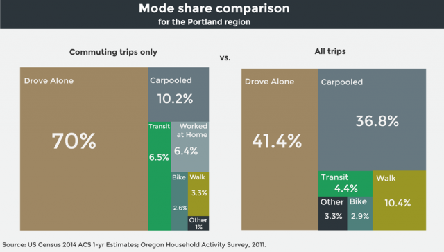
(All charts via Metro)
Metro is the only elected regional government in the United States. It’s also got one of the most interesting government communications teams in the country. Like MLB.com, Metro hires people to write journalism-style coverage of itself.
For its latest project, a four-part “regional snapshot” about transportation, the agency pulled out all the stops: original tilt-shift photography, narrative video, text drawn from at least a dozen interviews and a whole quiver of custom-made infographics. If you want a single overview on the basics of the region’s transportation situation, I’ve never seen a better one.
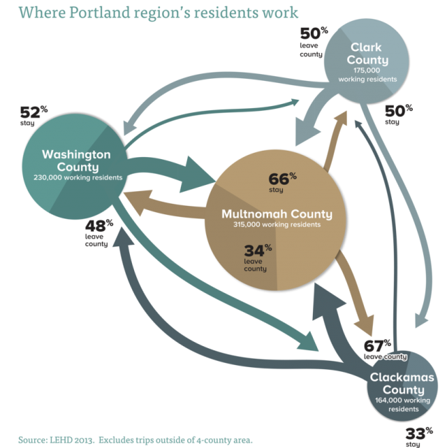
Here on BikePortland, we’re going to take advantage of this government-generated content and share a few of the many eye-opening charts Metro shared in the post. Here’s one about home and job locations that shows how interconnected, and yet different, the metro area’s four counties are:
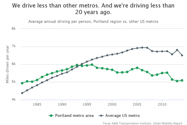
Here’s a look at the Portland area’s unusual success in reducing auto usage … but note that the vertical axis doesn’t start at zero. The region isn’t so much of an outlier that we look impressive unless you zoom in.
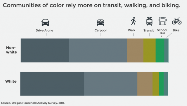
Here’s one that busts the persistent myth that people of color “don’t bike” and putting other modes in context:
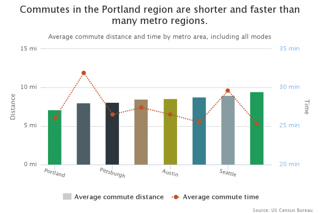
This chart shows how the Portland area is beating many peers on the metrics that matter most during rush hour: how much time and mileage it takes to get to work. (Sadly, the federal government that funds Metro’s transportation work continues to act as if the thing that matters is the velocity at which cars are moving — that’s not the same thing at all.)
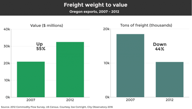
And here’s a look at one of the big forces behind the idea that “more highways = more jobs”: truck freight. Freight has long been a significant part of Portland’s economy, and it still is — because even though the number of actual trucks is falling, the value of the stuff they’re carrying is going up.
Those are just a few of the insights to be found in Metro’s big, beautiful report. Check it out — you did pay for it, after all.
— Michael Andersen, (503) 333-7824 – michael@bikeportland.org
Our work is supported by subscribers. Please become one today.
The post Six neat charts from Metro’s new report about Portland-area transportation appeared first on BikePortland.org.
from Front Page – BikePortland.org http://ift.tt/1TwVvIg
No comments:
Post a Comment